
Making art can be difficult, particularly for new artists. It can be daunting to translate the intricate shapes and forms we see in real life onto a painting, which causes many people to concentrate on the smallest details rather than the larger picture. This widespread propensity to obsess over minor details frequently detracts from expressing the main idea of the issue, which makes the process tiresome and time-consuming.
The need to “fix mistakes” or “make it perfect” without first establishing the piece’s overall structure or flow is typically the source of novices’ frustration. A piece that feels rigid, overdone, or inconsistent may result from this. The good news is that the secret to realizing your artistic potential is simplification.
The following article will discuss how to simplify your art, the importance of starting with the fundamentals, and useful strategies to support the idea of simplification. You may construct a solid foundation that will make your art more dynamic and pleasurable to create by simplifying difficult issues into accessible shapes, concentrating on composition, and highlighting flow. Let’s get started and learn how to be simple!
Understanding Of the Basic
Understatement, in my opinion, is the first step in producing the best work.Knowledge, experience, and practice are the keys to understanding. Even if you watch every art video and study every art book, you will still make mistakes the first time.
To begin designing characters, you must understand the fundamental shapes from squares to cubes and how to create lines and objects both 2D and 3D objects.
Different Type of Simplification
Something can be smpfy in a variety of ways. Everyone has an own way of thinking and seeing the world, and some people even create their own kind of simplicity. One of my favorite artists, Samis Art, mostly uses circles to convey a fundamental message. If you watch Disney’s backstage, you can see how they use references to break things down and on occasion exaggerate in order to achieve an artistic impression.
During my study, I discovered a variety of ways artists attempt to draw the various shapes using lines, cubes, and circles.I will discuss how they accomplish that and what factors they take into account.
Shape
- Shapes, oh! The fundamental building blocks of art are shapes, which are used to simplify intricate forms. Thankfully, this isn’t as daunting as geometry; it’s about using basic shapes like squares, triangles, circles, and ovals to interpret your observations.
- Shapes facilitate the understanding and drawing of bodies, objects, and settings by breaking down anatomy. For example, the limbs may begin as tapered lines or cylinders, the torso as an oval or rectangle, and the head as a circle.
- These streamlined forms provide you with a structure a kind of “skeleton” that greatly facilitates subsequent work refinement. Whether you draw them loosely as “broken down” forms or employ whole shapes, the goal is to highlight the substance of your topic rather than getting bogged down in tiny details.
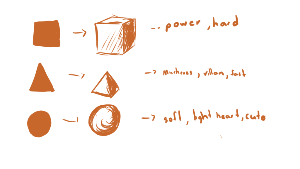
- Shape language gives your artwork an additional level beyond structure. Certain feelings or concepts can be evoked by different shapes. For instance, ovals and circles have a gentle, amiable, and approachable feel.
- However, because of their sharp tips, triangles are associated with energy, danger, or speed. Rectangles and squares communicate power and dependability because they feel solid and grounded. Even in the early drafts, you may add personality and emotion to your figures or designs by purposefully applying shape language.
- Ultimately, mastering shapes will help you create stronger, more dynamic art. By starting with simple forms, exploring shape language, and paying attention to space, you’ll not only simplify your process but also improve your ability to convey ideas and emotions through your work.
Lines
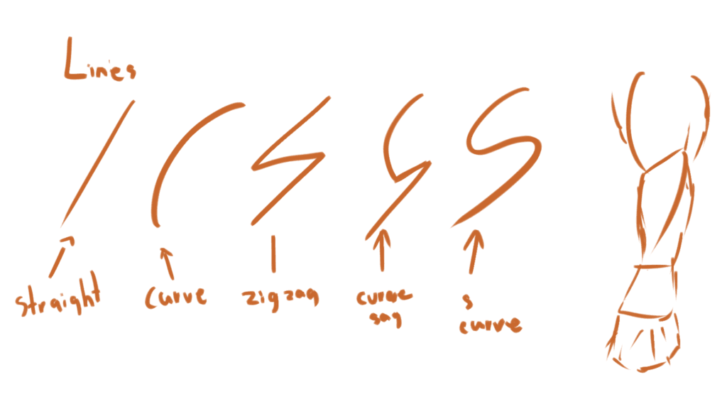
- One of the most fascinating forms of art is the line, and you’ve probably already seen how much it can alter a piece’s mood. Lines are all about expression and vitality, in my opinion. They communicate stories and are more than just borders. Line weight, or how thick or thin your lines are, can provide depth, highlight key elements in your picture, or even convey emotion.
- Thinner lines can be used for finer details or broader ones to draw attention to important regions. Give it a try! Your artwork will inherently feel more dynamic and captivating when you experiment with line weight.
- I normally use different colors for my lines when I sketch, and you should do the same! It’s a fantastic method to maintain organization in your work, particularly when working on a large project. For instance, in order to block out the fundamental outlines and structure of my design,
- I may begin with light blue or red. I then add clarity and refine the features using deeper hues. You don’t have to follow this approach, but try it out; it can help your process feel more enjoyable and clear.
- Not only can lines help define shapes, but they also direct the viewer’s eye and give your work personality. Remember that your lines don’t have to be flawless, whether you’re working on a professional piece or a casual sketch. Pay attention to the energy and flow. Once you stop worrying about every little wobble, you’ll notice that your drawings begin to come to life. Continue experimenting; you’re capable!
Flow
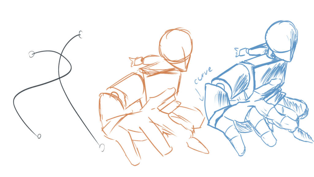
- According to my research, one of the most crucial components of making work that seems alive is flow. The fascinating elements of a composition are its motion, energy, and rhythm. When I concentrate on flow, I consider how everything moves and connects rather than just shapes or lines. It’s what distinguishes a drawing that feels vibrant and alive from one that is stiff.
- Gesture painting is one method that works for me for achieving flow. These are brief drawings that focus more on the subject’s motion than its specifics. The skeleton of movement, in my opinion, is gesture, which indicates the beginning and finish of energy. Capturing the emotion is more important than being flawless. When I’m drawing gestures,
- I’ve also noticed that understanding stress points and weight points is crucial. Stress points are areas where tension is happening like where a person is leaning or stretching. Weight points are where the body carries its mass, like a foot pressing into the ground. I use these to exaggerate or emphasize certain areas to make the pose feel more grounded or dynamic.
Structure
- A beautiful sketch is built on a foundation of shapes, anatomy, lines, and flow. I begin by blocking out the fundamental form and proportions of the body using forms like circles, ovals, and rectangles. The framework is easier to arrange thanks to these straightforward shapes.
- I then emphasize the energy of the stance by adding gesture lines to portray the movement and flow. This gives the sketch a more vibrant, dynamic feel. I use line weight to highlight details with thinner lines and stress and weight points with heavier ones.
- I improve the sketch using basic anatomy by comprehending how the joints link and how weight is distributed. Lastly, I make sure the stance feels natural by balancing positive and negative space. This approach ties everything together into a strong, fundamental sketch.
Important of Big to Small
As a novice, one of my biggest errors was paying too much attention to the minutiae at first. I would start by adding small details that most people wouldn’t even notice, only to discover later that my drawing’s overall structure was flawed. I eventually discovered that it’s far more effective to work from the outside in from large forms to minute details.
Establishing a solid foundation is facilitated by beginning with the broad view. I now make sure everything fits together by blocking out the main forms and dimensions first. After that, I progressively add details and refine. This method has improved the coherence of my artwork and saved me a ton of time in correcting errors. It makes a great difference to always think large first!
